
What is an Interface?
An interface is a boundary. It’s all the points of contact, physical and cognitive, between two separate systems. While some people take a narrow view and see interface design as concerned only with “look and feel,” we use an expansive definition—an interface is the user’s entire interaction with any designed experience.
Included in our definition of interface design is “Conceptual Design” which shapes what a product does, and “Interaction Design” which determines how a product behaves, often by examining what users want to do with it. Both Conceptual Design and Interaction Design are more fully discussed on this website’s Design Process page.
The hard work in developing an interface lies in understanding the cognitive needs of an audience and then meeting those needs, while shaping and fulfilling audience expectations.
An interface should be both simple and clear. The hard work in developing an interface lies in understanding the cognitive needs of an audience and then meeting those needs, while shaping and fulfilling audience expectations.
Software includes webpages. People use software to achieve a goal. The interface can either help or get in the way. Designers who consider user goals produce far more effective interfaces than those who base their designs on aesthetics alone.
Interface design is much more than a subset of the graphic arts.
The difference between an interface that helps or hinders a user is rarely the difference between pretty buttons and ugly ones. While there’s an aesthetic component to a well-designed interface, interface design is much more than a subset of the graphic arts.
Knowing the Intended Audience
To help us understand and improve interface design, we’ve developed our own model: the “Interface as a Problem-Solving Medium.” This model focuses on the end user. It assumes that when people sit down to do a task on a computer, they are trying to solve problems. The problems can be viewed broadly (e.g. writing a letter) or more narrowly (e.g. changing the margin). The Problem-Solving model is appropriate even when the goal is entertainment or information gathering or shopping. When playing a game, the goal of the user might be to just have fun or relax, but the tasks involved can be thought of as problems requiring solutions. The problem-solving model focuses on the people who intend to use the interface—the end users—and it is particularly conducive to helping designers produce a more satisfying, user-friendly interface.
The Problem-Solving model requires a keen understanding of how people really set about to solve problems on a computer. But instead of flailing in the dark, the problem-solving model allows interface designers to direct their attention to the issues most relevant to users. Interface designers can use their knowledge of cognitive science, psychology, learning acquisition, and human perception to try to support users as those users solve problems in a computer-based environment.
When people sit down in front of a computer, they are confronted with a large number of problem-solving situations: “Which application will do what I want? How do I launch it? Where is my file?” To understand how people solve computer-related problems, we need to understand the factors that influence problem-solving generally. These factors include domain knowledge, the development and application of problem-solving strategies, the circumstances under which the problem is tackled, and an individual’s perceptions.
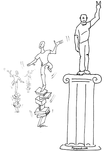
The most important thing to consider when designing a piece of computer software or a website is the intended audience of the product. Who is going to use this project? Why are they using it? How are they going to use it? Where are they going to use it? What do they want to do with it? The answers to these questions always directly impact the design.
Over the years, we have given a great deal of thought to these questions and have made some observations and crafted some guidelines that keep us on track while developing new projects. A few of these are offered below.
Who is going to use this product?
We are all different. We come from different backgrounds, different cultures. We like and dislike different things. But we also have much in common. In particular, people tend to develop cognitive and emotional skills on a similar timetable. Most of us can read by the age of eight, for example. We also tend to congregate in groups of special interests—some of us are gardeners and some are into antiques. A good design takes into account the differences as well as the common interests of the particular group of people who will be using the product. The more we understand the desires, expectations, and limitations of our users, the better we can serve them. Developing realistic user personas can help a designer focus on the attributes of a real person rather than an abstraction.
For a child, the learning curve should be as shallow as possible. A child should always be able to do something satisfying with a software product right away. The interface of an application geared to children should be based on their early experiences and use as many support structures as are necessary to help them succeed. A child should never be made to feel stupid or incapable by a programmer’s poor error handling technique. Statements like: “You have committed a fatal error” are absolutely unacceptable. (Actually, we’d vote to completely abolish that particular error message, except perhaps if you’re designing computerized medical equipment for surgeons.) And while stability is desirable in all software, a special effort should be made to ensure that applications designed for children don’t crash. Over and over again, we see programs for kids that freeze while a child is trying to save their work.
Seniors represent a large group of Internet users. This population has its own particular challenges and expectations regarding computer use. Physical problems like poor eyesight and mobility difficulties, and cognitive problems such as short-term memory loss, have to be considered in the design of websites geared to this population. A website for this audience should anticipate when its users may experience anxiety, fear, or frustration, and then design around these issues.
Why are they using this product?
Take a word processing application as an example. An executive may want to be able to use the software with little or no training. She may want to use the application as a typewriter with a backspace key. Her secretary may need to use the application for more demanding tasks—creating columns, doing a mass mailing, creating style sheets. It is important that the word processing application open like an onion to permit these different types of users to access these features painlessly. Perhaps the features should get out of the way when the executive is drafting the letter, but be accessible when the secretary needs to lay it out on the page.
The purpose of a product—whether it’s to be used for learning, as an entertainment, or as a tool—dictates the function of the interface.
How is this product used?
Most often a product fails because the designers have not properly anticipated the actual desires of the people who use it. The web is filled with examples of this type of poor foresight. Sometimes it amazes to see how little thought is given to why the actual visitors to a site might go there. How many corporate websites have you seen which happily display photographs of a company’s office exterior but fail to provide a customer service number or an email address? How about the website for an international manufacturing company which provides mission statements for each of their divisions, but fails to have downloadable manuals for the products they sell? How about the university website that details their organizational structure, but fails to provide a navigable campus map?
Marketing campaigns on television and print are frequently not integrated with that company’s web campaign. Over a decade ago, for example, BeBe, a company which manufactured women’s jeans, spent hundreds of thousands of dollars covering walls, billboards, and buses with ads for their new line—each ad had the website address written in bold letters. But on the website, they didn’t feature the particular style of jeans they had been advertising, nor did they provide any information about where the jeans could be purchased locally, nor was there any way to even buy the new line of products through their website. They created the site thinking of it as a corporate brochure, but people went there hoping to get information about the product and to make a purchase. A customer responding to their ad would fail to accomplish their main goal and leave the site unhappy. This is not an e-commerce success story.
Where is this product used?
The actual location and circumstances of use must be carefully considered in product design, and accommodations must accordingly be made in interface and content design.
People approach computer tasks differently depending on their physical location. There is a difference between using computers at home, at work, at school, and at places like a museum or a shopping mall. Human perception changes from circumstance to circumstance, as do the limits of working memory allocated to a task. So, for example, a navigational system that might be obvious to a user sitting quietly at home in front of a computer may confound that same person looking for a gate assignment at an airport kiosk. An extreme example is looking at an informational kiosk in a museum to find a bathroom while your kid hops up and down shouting, “I have to pee!”
In a classroom, students often work on projects in groups. Learning on a computer as part of a group is different than doing so alone. A teacher needs to pay attention to the distribution of expertise within a group, to the effect that a student’s social status has on his or her ability to function in that group, to the way information is propagated throughout the group, and to the development and spread of computer-related mythology within the group. By recognizing the existence of these factors, teachers and software developers can design activities that compensate for them, making all students into participants and encouraging them to use their particular expertise to be empowered in a special niche within the group.
The Emotional Feel of a Website
Users get an emotional impression of their interaction with a website. When they leave, most people’s primary impression won’t be a memory of the informational content. Rather, they’ll retain a vague feeling of ‘good’ or ‘bad’ evoked by their experience.
So what is the emotional impact of your website? Is your user happy? Do people leave your site frustrated or satisfied? Is your home page overwhelming, confusing, or intimidating?
Emotion is a strong memory trigger—emotionally charged memories are easier to retrieve from long-term memory. So what are the principles of emotionally savvy web design?
-
Frustration on the web builds negative perceptions. If anything goes wrong, even with the user’s own connection, the website is often blamed. Site designers can’t prevent some of this, but designers can try to reduce frustration where possible: performant pages that load quickly, links that work, good security practices, good information design practices, no memory leaks, no glitchy tech, no unexpected misdirection, forms that don’t clear unexpectedly, and tasks that can continue even if the user goes offline.
-
Users are suspicious when asked for personal information. They scrutinize each request to evaluate if the site really needs the information and speculate on how they can be hurt by divulging it. Any suspicion that they are being conned and the users’ trust in a site will be gone. Avoid overreaching when asking users’ for information, even at the risk of disappointing your marketing department. Only request that which is absolutely necessary to fulfill the users’ own goals on the site.
-
Have you ever written an email and had it completely ignored? How did that make you feel? If your customer service department doesn’t answer your visitors’ email inquiries, your users will feel that way about you.
-
Be polite. There was an interesting experiment where two groups of beta testers were asked to evaluate a program. In one version, the dialog boxes and error messages were particularly polite—with “please” and “thank you.” The beta testers of the polite program not only liked it more but also reported it as both more functional and stable than the other version. So be polite. A page on the web is seen as more personal than a printed page of a brochure.
-
You need to know your audience and set the tone of the site accordingly. It’s important to talk to users in a non condescending manner that uses language within their level of expertise. If the product is designed for a professional audience of physicians, don’t talk to them as if they are children. If the product is designed for patients, don’t talk to them as if they are physicians.
An emotionally savvy product may:
-
have an interface that helps users overcome their frustrations and fears
-
have an interface that sets the right mood
-
have an interface that changes indifferent or casual interest into directed motivation
-
uses humor to reduce an impression of condescension
-
promote a feeling of personal choice while still guiding users towards action items
-
create emotional “ah ha” moments to make users’ experiences more memorable
An airline tried to save money by reducing how often they washed their planes. Customers reacted negatively. Dirty planes were equated with poor maintenance. Customers couldn’t see the airline’s maintenance but they could see the dirt. Similarly, a website is a strong public reflection of the company. Users translate a negative experience on the site into a negative view of the company generally. What users take away from a troubled site may not be rational, fair, or true, but they’ll act upon that perception nonetheless.
We’ve come up with two underlying website properties which affect how users feel in relation to websites. The first is a website’s “transparency” and the second is its “thickness.” These properties can be adjusted to affect the users’ perception of their relationship to the site.
Transparency and opacity form two poles of one continuum. If a website is transparent, the user feels known. If a website is opaque, by contrast, the user feels anonymous. Transparency might be desirable in a community site while a pornographic site might prefer opacity. Most sites are somewhere in between. Amazon, for example, retains information about its users and tries to entice them with other products that have some relationship to previously browsed items. If Amazon is too transparent, users might avoid purchasing a steamy potboiler because it doesn’t match the image they wish to project. In an episode of The King of Queens, Spencer believes that his TiVo thinks he’s gay based upon its program recommendations. By recording macho programs he has no intention of watching, he hopes to impress TiVo with his masculinity.
Thickness and thinness, similarly define opposite poles of a spectrum. If a site is thin, users feel that humans from the company are accessible to them. If a site is thick, users feel far removed from any humans on the other side of the screen. Good customer service strives to feel thin, to give customers a sense that real people are readily available. While surfing a website with a thin interface, users don’t feel as if barriers have been erected to keep them at a distance. By contrast, many large corporate sites feel thick to outside visitors. Corporate officers often mask their contact information to keep users at arms length. Thick interfaces often feel more formal than thin ones.
Transparency and thickness are two qualities that affect the “emotional intelligence” of a site. We’ve found them to be useful concepts in our own work. We consider them carefully during the design and testing phases of site construction.
The most important steps to raise your site’s emotional intelligence is figuring out who’s the site’s audience, what is it they want, and how you can provide it.
The emotional intelligence of a website gets easily overlooked in a board meeting, but it doesn’t get overlooked by the site’s users. The most important steps to raise your site’s emotional intelligence is figuring out who’s the site’s audience, what is it they want, and how you can provide it.
User Performance Limitations
Human task performance can degrade under adverse environmental and psychological conditions. Cognitive traits — working memory, long term memory retrieval, attentional controls, and perceptual capabilities — are situationally dependent. For example, anxiety impairs performance. Anxiety can be caused by time pressure, competition, inexperience, attaching significance to the outcome, external annoyances (e.g. flashing lights) and so on.
Working memory is limited. During a task, it needs to accommodate data, procedural information, goals, and planning. A user’s emotional state limits it further. Under stress, an individual’s performance slips as their cognitive space is overwhelmed by emotion. Too much information also overloads the users capacity to process and hold that information in working memory. If the task is unclear, users might founder, using working memory for off-task processing.
Some people find it easier to concentrate at home, while others prefer the hum of a workspace. But if a user is constantly interrupted, attentional capacity is compromised. Time pressure robs some users of their ability to concentrate on a task, while others find it motivating. Competitive environments where users need to constantly monitor not only their own progress but also that of others can drain the cognitive resources of some users while spurring others to new heights of concentration. Interaction and interface designs can help solve some of the problems which arise from environmental conditions. For example, a website designer might create a one click system for critical functions or limit the number of hierarchical levels to help prevent navigational errors.
A Bit About Usability
There are three factors that can be measured by product usability studies: usefulness, learnability, and satisfaction. Each of these can be broken down into the conceptual design, interaction design, and interface design components. A good usability script—a set of questions that guide usability studies—would unearth problems with any of these components.
Usefulness
Conceptual Design:
-
Are the goals of the company, designers, and users aligned?
-
Does the product meet the expectations of its users?
-
How useful is the product for the purposes for which it was developed?
Interaction Design:
-
Is the product too difficult to use?
-
Is the user’s performance on a task enhanced by the product? Does the product assist the user in doing something faster, better, etc.?
Interface Design:
-
Are all of the functions of the product clearly visible to the user?
Learnability
Conceptual Design:
-
What is the minimum level of desired performance?
-
How much training do users need to achieve the minimum level of desired performance?
-
Does the learnability curve match the expected usage of the product?
-
How forgiving is the product to a user’s error? Are there enough “undo’s” built into the system?
-
Is there built-in help?
-
Has the right metaphor been adopted for the product? Do users get it?
Interaction Design:
-
Are rewards built into the product for novice users?
-
Are expert users burdened by design features intended for novices?
-
Is the built-in help helpful? Does it address real problems that users have?
-
Do the features of the product rely on recall or recognition?
-
Are there default settings (e.g. filling in the current date in a date field) built into the product?
-
How closely does the adopted metaphor conform to the use of the product? Do users understand areas where the metaphor no longer applies?
-
Has the users’ expertise with similar products been employed to best effect? Have industry standards been followed? Do the product’s windows and menus work like windows and menus of other products in the same field, for example?
Interface Design:
-
How easy is it to get help? Is it contextually embedded into the product?
-
How clear are the navigation items? Are the buttons labeled with users’ expertise in mind?
-
How well is the adopted metaphor executed? Do the gears look like gears to the users, for example? Does a floppy disk icon evoke a “save file” user response?
-
Has user expertise with similar products been utilized to best effect? Do the product’s icons and buttons look and feel like icons and buttons of similar products? If they vary, is there a good reason for them to deviate from the norm?
Satisfaction
Conceptual Design:
-
Do users believe that the product has value to them?
-
Does the value match its price?
-
Would users invest the necessary time to learn the product?
-
Was the right metaphor adopted? Does it have the right emotional tone?
-
How do users feel about using this product?
-
Would users recommend this product to others?
-
Is the product in “good taste?” Is it culturally appropriate for its intended audience?
Interaction Design:
-
How do the users feel about themselves while they use the product? Do they feel stupid for not “getting” it?
Interface Design:
-
Are users offended by the colors or images used in the product?
-
Does the look and feel alienate a potential group of users? (“Oh, this product is for boys!” “I wouldn’t use it—it’s for old people.”)
Clearly, there‘s plenty of overlap between these categories. Data to assess usability is often gathered by guiding users through usability scripts, but other techniques such as eye tracking can be used to evaluate the visibility of certain design elements. One doesn’t need to wait for a finished project to do testing; it’s often done with screen or even paper mockups.
There are limits on what you can expect from a focus group. They are useful to identify major flaws in a product, but less useful at suggesting a fix for identified issues. A focus group can’t redesign a product. Allow the focus group to point out issues that are within their expertise as users and then allow designers to come up with solutions.
Notice that while you shouldn‘t ask users to design the product, you do want to elicit information about users’ opinions: Do they like it? Are they comfortable with it? Would they buy it?
Finally, a usability study shouldn’t be wasted on uncovering technical glitches in your product. If a beta version is being analyzed, set up a system that is known to work and is stable. After the product is adjusted to increase usability, technical glitches can be addressed by quality assurance personnel for the final release.
Our book, “Interfaces.com: Cognitive Tools for Product Designers”, details our cognitive science approach to interface design. Building on the academic literature characterizing different attributes in individuals’ personalities, perceptual preferences, cognitive abilities, and learning styles, we’ve developed a multivariate approach to understanding the cognitive differences between people—particularly the way that people perceive information and solve problems. Understanding these differences allows us to craft solutions which support a wide variety of learning styles. It also allows us to accurately predict how different interface design strategies will work for individuals with particular traits.
Human cognition is a famously complex process. It is hard to summarize or even explain what makes an individual good at something, or what makes her a good learner or a good thinker. Different scientists studying cognition have developed different taxonomies of cognition depending on their goals and the aspect of cognition that they were interested in researching. In our work, we focus on using cognitive science to engineer educational solutions and to design better human/computer interactions. Thus, we developed what we call the Cognitive Wheel as a way of trying to think about cognitive attributes in the context of product design. This taxonomy is oriented to technology problems. But it tries to incorporate as many ideas as possible from other cognition theories.
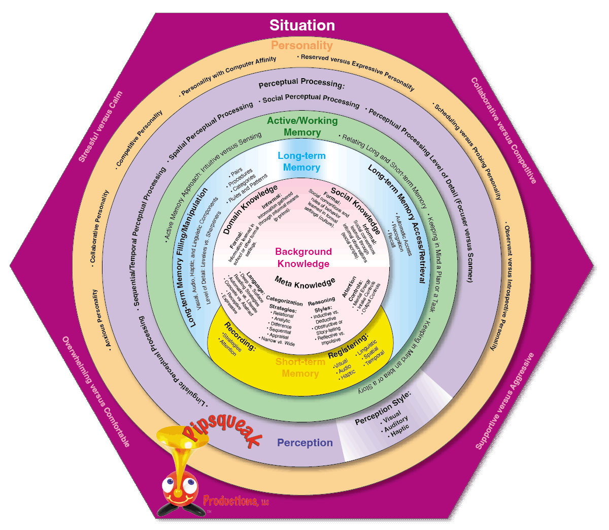
Pipsqueak’s cognitive wheel is a way to visually represent the different aspects of cognition and how they influence one another. (press or hover to enlarge)
We’ve summarized research in education and cognitive science into a set of variables we find most useful to consider when creating computer-based materials. We broadly divide cognitive attributes into:
-
Background Knowledge
-
formal and informal background knowledge of a particular domain
-
cultural and social norms
-
meta knowledge
-
-
Perception
-
perceptual style
-
perceptual processing
-
-
Personality
-
anxious
-
collaborative
-
competitive
-
computer affinity
-
expressive vs. reserved
-
observant vs. introspective
-
schedulers vs. probers
-
-
Memory
-
short-term memory
-
working memory
-
long term memory management
-
Most of these cognitive attributes are situationally dependent. So it’s important to consider the setting and circumstances under which the product is to be used.
Awareness of the variety of individual characteristics assists effective online design. For example, a chat room might not work well for an individual with expressive linguistic difficulties. But an opinion poll could provide an entry point to a discussion for people who would otherwise not participate at all. As another simple example, some individuals with attention control problems have difficulty processing large amounts of information at one time. Dividing the information into smaller encapsulated chunks makes the material accessible to those users without hurting its value for others.
The Cognitive Wheel represents our synthesis of the literature in educational research and personality assessment with an eye towards its use in solving product design problems. What’s most important for a product designer is to be able to identify a particular set of cognitive traits that are relevant to an individual working with a product under specific conditions. Once the strengths and limitations of users with this set of cognitive traits are understood, a design can be fashioned to support them during their interaction with the product. Interaction design isn’t about making websites navigable. It’s about creating online experiences that are well-suited to the needs and predispositions of its audience.